Regardless though, I do appreciate the society, and sorely wish that I could attend more, if it were not for my different timetable to everyone elses' and my piling up of work as pressure drives down for interviews.
Now, a discussion was brought up on the facebook group page about the society's logo:
Let's compare MMUGG's logo and University of Manchester Gaming Society's logo:
Both differ greatly in their approach.
On the one hand, we have MMU's very bold, simple and effective logo, a silhouette of an xbox 360 controller with "mmu" written in Arial Black to denote which university it belongs to. It could be argued that it's a little plain, but the message gets through clearly - "gaming at MMU".
On the other hand, Manchester University's logo appears a lot more friendlier, more colourful, but I have to disagree with the presentation of the type - the "g" is too obscured behind what is a well drawn SNES controller, but that in turn is obscured by the "s". I can only comment that this is perhaps a bad layout decision, but otherwise, the individual elements could serve to make a nice logo. The choice of a fourth gen SNES controller as opposed to a current gen seems to denote they have more appreciation for classic gaming, but I'm unsure if that is their desired communication.
Well, it wasn't really asked for, but I felt like it would be a bit of fun, I volunteered to re-design the MMU logo for the Gamer's Group. Yes, even though I'm already busy with portfolio mounting, one day projects and personal project, I still decided to put out 2-4 hours on this little self commission.
And here are the results:
 |
| First Draft |
 |
| Second Draft |
 |
| Third Draft |
So here are three drafts of the logo. The first one was an immediate reject to be honest. I had wondered that the gaming society is affiliated with MMU, so why is there no university logo to go with it? For all we know, the "mmu" on the current logo could denote to "Multi Media Union" or something. But as you can probably see in the layout of the "MMU GG" it now looks like I've created some sort of face - not a friendly one either.
The first two drafts has the inclusion of the big three gaming platforms I've noticed at the Kyoto Lounge so far: PC, PS3 and XBOX 360. It made sense to try and add three representations of the platforms into the logo, however the icons appear too small - all we'd really see as a whole is the MMU logo, and unless I went out of my way to add even more detail to turn it into a type of coat of arms, as the second draft stands, it's too simple to notice the icons, and not detailed enough to be worth zooming in to take a closer look. Also, I tried to put the words down the side to see how it looked. It worked, but it's gotten too big now.
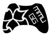
The third draft, I decided to just revamp the current design. I mean it works so well, why radically change it so much? However, I've chosen a controller that is universally recognised generically and specifically - for example show the controller to someone clueless about gaming and they'd be able to splutter something along the lines of "game-station-play-boy-360?".
The face buttons have the MMU logo instead and there is some bitmap type to say "MMUGG".
But there's more.
It's a funny thing, the more I looked at the original, the more it looked well suited and well designed, but there was just something that could be done better. A lot of it rides on the already well designed xbox controller, but hey it works, it's just the choice of type that throws it off a bit. So how about just replacing the text with the MMU Logo? There's even a version with "GG" in it to denote "Gamer's Group".
I also decided to invert the third draft to see how it looked, and it looks alright.
Anyways, moderators and administrators, I leave the decision to you, which logo to use: if none of my iterations have marked any improvements, by all means stick to the original that does pretty well anyway. Do leave comments please and thanks for reading (if you bothered) :)
Even more after some quick feedback:

After further feedback, it seems the XBOX 360 controller is the preferred representation of the height of social gaming. So, really sticking with the base of the original logo, I tried to impliment the MMU logo in a way that didn't remind everyone of the recycle pictogram. The choice of Arial Black didn't quite add up well to the logo overall, so I took a look through several fonts:
Well, after spending quite a bit of time, I think I'll settle with one final design - mods and admins of MMUGG, feel free to use any of the designs here, if there's something in particular you'd like tweaking, post a comment and I'll modify a design.

 |
| [click to enlarge] a sample of how the logo would look in use |


No comments:
Post a Comment