*cricket chirps*
*tumbleweed*
Gosh, this place is dusty. Pretty cold too.
My first term at Central Saint Martins has been largely undocumented on this blog. Adjusting to life in London, keeping up with my course as a student and student rep, as well as being actively involved in my music society seems to have re-routed most of my energy.
However, the xmas holiday season is upon us, and I shall endeavor to revamp this ol' place up. Learning code is on my to-do list, and with all these talented people here at UAL, I hope to really tear it up.
Showing posts with label personal. Show all posts
Showing posts with label personal. Show all posts
Tuesday, 6 December 2011

Sunday, 11 September 2011

Wednesday, 10 August 2011
A tribute to our police
As you may or may not know, England has been plagued with some surprisingly awful riots. It started in London and has spread throughout the countries in major cities, one of which includes my current home city of Manchester.
As I type now, The Greater Manchester Police have commited their best to fend off the thugs and scum from damaging the city too much. For that, I solemnly salute their efforts and courage.
I offer my tribute to them:
Here's hoping the violence will be ending soon.
As I type now, The Greater Manchester Police have commited their best to fend off the thugs and scum from damaging the city too much. For that, I solemnly salute their efforts and courage.
I offer my tribute to them:
 | ||||
| [click to enlarge] |
Here's hoping the violence will be ending soon.
Thursday, 4 August 2011
High Speed Camera Action (a.k.a. slow motion footage)
Look what I managed to borrow :D
This is what I shot with it:
Enjoy the video : )
 |
| Casio EX-F1 |
This is what I shot with it:
Enjoy the video : )
Sunday, 19 June 2011

Thursday, 31 March 2011
A Proud Moment to share
Dear readers (all 2 of you... XD),
It is to my delight to inform you that all my hard work has paid off with a wonderful result of an "Unconditional" decision from The Glasgow School of Art.
This makes me very happy :D
It is to my delight to inform you that all my hard work has paid off with a wonderful result of an "Unconditional" decision from The Glasgow School of Art.
 |
| I know it seems bitter to say this... but SCREW YOU KINGSTON! |
This makes me very happy :D
Sunday, 27 March 2011
An Italian liqueur
Upon my mother's return to England, from Italy, she gave me a packet of Baci chocolates (courtesy of a friend she was staying with), an itallian map themed apron and tea towel (so what, I like to cook) and an individual's bottle of Limonoro's Limoncello Liqueur... in the shape of a violin :D
The taste is undeniably of lemon (but of course) and it's alcoholic, yah yah. *sigh* look I'm no drinks connoisseur ok?! But the bottle and label are very splendid, and although I can't quite express why the drink was nice, I did enjoy it dry and with a bit of ice.
Onto talking about the packaging:
The plastic wrapping with the cardboard tag is practical, but it does remind me of the cheap wrapping you'd get with a cheap plastic toy of sorts, usually found in a souvenir shop that was placed for the sake of tourism for tourism's sake. Other than that, the actual bottle and label are fantastically designed and produced.
 First of all, the label belongs to a brand known as Limonoro, a company that makes Limoncello and other lemon liqueurs for an assortment of chocolates as well as other beverages. It is shaped like a lemon leaf, and reminds me of Jiff's packaging for lemon juice in that approach. The font is something I am unable to identify, but I am running it through WhatTheFont's forum to see if anyone has any idea what it is exactly (I'll keep you posted about that).
Now, onto the remarkable part: The bottle itself. It is shaped like a violin! w00t! I play(ed) the violin and having a bottle shaped as one feels remarkable. Also, it's small and seems collectable and decorative. Also, there's a nice touch with the bottle lid being attached with a metal bale (I'm unsure what the technical term for this kind of lid is...) but it gives a vintage feel about it, as opposed to the metal caps found on most bottled alcohol. On closer inspection, you can even see the details of the strings and sound holes (the "f" looking parts) have been moulded out.
All in all, it comes out as a very neat little object that can still be kept and displayed long after the liqueur has been consumed. A seemingly perfect souvenir stuff that can be enjoyed in both short and long term.
 |
| a brand new bottle in packaging fit for plastic toys... |
 |
| so it comes from Sorrento, just south of Napoli |
 |
| if you haven't noticed already, the bottle is a violin shape |
 |
| some sort of official documentation of authenticity |
 |
| yes, it's rather strong, should be drunken in shots I think |
 | ||
| but ehm... I decided to drink like a whiskey... |
The taste is undeniably of lemon (but of course) and it's alcoholic, yah yah. *sigh* look I'm no drinks connoisseur ok?! But the bottle and label are very splendid, and although I can't quite express why the drink was nice, I did enjoy it dry and with a bit of ice.
Onto talking about the packaging:
The plastic wrapping with the cardboard tag is practical, but it does remind me of the cheap wrapping you'd get with a cheap plastic toy of sorts, usually found in a souvenir shop that was placed for the sake of tourism for tourism's sake. Other than that, the actual bottle and label are fantastically designed and produced.
 First of all, the label belongs to a brand known as Limonoro, a company that makes Limoncello and other lemon liqueurs for an assortment of chocolates as well as other beverages. It is shaped like a lemon leaf, and reminds me of Jiff's packaging for lemon juice in that approach. The font is something I am unable to identify, but I am running it through WhatTheFont's forum to see if anyone has any idea what it is exactly (I'll keep you posted about that).
Now, onto the remarkable part: The bottle itself. It is shaped like a violin! w00t! I play(ed) the violin and having a bottle shaped as one feels remarkable. Also, it's small and seems collectable and decorative. Also, there's a nice touch with the bottle lid being attached with a metal bale (I'm unsure what the technical term for this kind of lid is...) but it gives a vintage feel about it, as opposed to the metal caps found on most bottled alcohol. On closer inspection, you can even see the details of the strings and sound holes (the "f" looking parts) have been moulded out.
All in all, it comes out as a very neat little object that can still be kept and displayed long after the liqueur has been consumed. A seemingly perfect souvenir stuff that can be enjoyed in both short and long term.
Friday, 18 March 2011
Tate Modern: Ai Weiwei Sunflower Seeds - Answering a question
Well, I visited the sunflower seed exhibit at the Tate Modern. I must say, it's amazing to see in person, I'm just disappointed I couldn't get to jump into it and play around like I saw people do on BBC news... so disappointed >:(
Anyways, I digress. Here's a video of me responding to the exhibit, which Ai Weiwei will probably never see - the whole thing does seem interesting to spark discussion amongst online forums.
[Link to video]
Anyways, I digress. Here's a video of me responding to the exhibit, which Ai Weiwei will probably never see - the whole thing does seem interesting to spark discussion amongst online forums.
[Link to video]
Monday, 14 February 2011


Sunday, 13 February 2011
Let me lend you a H.A.N.D.
I had drawn these designs on my original line drawings of the guns for my Subject Matters Project. I decided to use a computer to achieve some better results.
The computer certainly allowed for a sleeker and quicker finish.
 |
| [click to enlarge] |
The computer certainly allowed for a sleeker and quicker finish.
Friday, 11 February 2011
MMU Gamer's Group Logo
The Gamer's Group is a society I decided to join when I went to the Freshers' fair way back in September. Cost me a good £6 for membership, and so far, I've only been able to attend about 3 socials - but my attendence hasn't been regular enough to really form much of a bond with my fellow gamers. Add in some scarce time from online games and I've only got the facebook group page to really chip in my bit.
Regardless though, I do appreciate the society, and sorely wish that I could attend more, if it were not for my different timetable to everyone elses' and my piling up of work as pressure drives down for interviews.
Now, a discussion was brought up on the facebook group page about the society's logo:

Let's compare MMUGG's logo and University of Manchester Gaming Society's logo:


Both differ greatly in their approach.
On the one hand, we have MMU's very bold, simple and effective logo, a silhouette of an xbox 360 controller with "mmu" written in Arial Black to denote which university it belongs to. It could be argued that it's a little plain, but the message gets through clearly - "gaming at MMU".
On the other hand, Manchester University's logo appears a lot more friendlier, more colourful, but I have to disagree with the presentation of the type - the "g" is too obscured behind what is a well drawn SNES controller, but that in turn is obscured by the "s". I can only comment that this is perhaps a bad layout decision, but otherwise, the individual elements could serve to make a nice logo. The choice of a fourth gen SNES controller as opposed to a current gen seems to denote they have more appreciation for classic gaming, but I'm unsure if that is their desired communication.
Well, it wasn't really asked for, but I felt like it would be a bit of fun, I volunteered to re-design the MMU logo for the Gamer's Group. Yes, even though I'm already busy with portfolio mounting, one day projects and personal project, I still decided to put out 2-4 hours on this little self commission.
And here are the results:
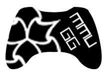
So here are three drafts of the logo. The first one was an immediate reject to be honest. I had wondered that the gaming society is affiliated with MMU, so why is there no university logo to go with it? For all we know, the "mmu" on the current logo could denote to "Multi Media Union" or something. But as you can probably see in the layout of the "MMU GG" it now looks like I've created some sort of face - not a friendly one either.
The first two drafts has the inclusion of the big three gaming platforms I've noticed at the Kyoto Lounge so far: PC, PS3 and XBOX 360. It made sense to try and add three representations of the platforms into the logo, however the icons appear too small - all we'd really see as a whole is the MMU logo, and unless I went out of my way to add even more detail to turn it into a type of coat of arms, as the second draft stands, it's too simple to notice the icons, and not detailed enough to be worth zooming in to take a closer look. Also, I tried to put the words down the side to see how it looked. It worked, but it's gotten too big now.
The third draft, I decided to just revamp the current design. I mean it works so well, why radically change it so much? However, I've chosen a controller that is universally recognised generically and specifically - for example show the controller to someone clueless about gaming and they'd be able to splutter something along the lines of "game-station-play-boy-360?".
The face buttons have the MMU logo instead and there is some bitmap type to say "MMUGG".
But there's more.


It's a funny thing, the more I looked at the original, the more it looked well suited and well designed, but there was just something that could be done better. A lot of it rides on the already well designed xbox controller, but hey it works, it's just the choice of type that throws it off a bit. So how about just replacing the text with the MMU Logo? There's even a version with "GG" in it to denote "Gamer's Group".
I also decided to invert the third draft to see how it looked, and it looks alright.
Anyways, moderators and administrators, I leave the decision to you, which logo to use: if none of my iterations have marked any improvements, by all means stick to the original that does pretty well anyway. Do leave comments please and thanks for reading (if you bothered) :)
Even more after some quick feedback:


After further feedback, it seems the XBOX 360 controller is the preferred representation of the height of social gaming. So, really sticking with the base of the original logo, I tried to impliment the MMU logo in a way that didn't remind everyone of the recycle pictogram. The choice of Arial Black didn't quite add up well to the logo overall, so I took a look through several fonts:


Well, after spending quite a bit of time, I think I'll settle with one final design - mods and admins of MMUGG, feel free to use any of the designs here, if there's something in particular you'd like tweaking, post a comment and I'll modify a design.
Regardless though, I do appreciate the society, and sorely wish that I could attend more, if it were not for my different timetable to everyone elses' and my piling up of work as pressure drives down for interviews.
Now, a discussion was brought up on the facebook group page about the society's logo:

Let's compare MMUGG's logo and University of Manchester Gaming Society's logo:
Both differ greatly in their approach.
On the one hand, we have MMU's very bold, simple and effective logo, a silhouette of an xbox 360 controller with "mmu" written in Arial Black to denote which university it belongs to. It could be argued that it's a little plain, but the message gets through clearly - "gaming at MMU".
On the other hand, Manchester University's logo appears a lot more friendlier, more colourful, but I have to disagree with the presentation of the type - the "g" is too obscured behind what is a well drawn SNES controller, but that in turn is obscured by the "s". I can only comment that this is perhaps a bad layout decision, but otherwise, the individual elements could serve to make a nice logo. The choice of a fourth gen SNES controller as opposed to a current gen seems to denote they have more appreciation for classic gaming, but I'm unsure if that is their desired communication.
Well, it wasn't really asked for, but I felt like it would be a bit of fun, I volunteered to re-design the MMU logo for the Gamer's Group. Yes, even though I'm already busy with portfolio mounting, one day projects and personal project, I still decided to put out 2-4 hours on this little self commission.
And here are the results:
 |
| First Draft |
 |
| Second Draft |
 |
| Third Draft |
So here are three drafts of the logo. The first one was an immediate reject to be honest. I had wondered that the gaming society is affiliated with MMU, so why is there no university logo to go with it? For all we know, the "mmu" on the current logo could denote to "Multi Media Union" or something. But as you can probably see in the layout of the "MMU GG" it now looks like I've created some sort of face - not a friendly one either.
The first two drafts has the inclusion of the big three gaming platforms I've noticed at the Kyoto Lounge so far: PC, PS3 and XBOX 360. It made sense to try and add three representations of the platforms into the logo, however the icons appear too small - all we'd really see as a whole is the MMU logo, and unless I went out of my way to add even more detail to turn it into a type of coat of arms, as the second draft stands, it's too simple to notice the icons, and not detailed enough to be worth zooming in to take a closer look. Also, I tried to put the words down the side to see how it looked. It worked, but it's gotten too big now.
The third draft, I decided to just revamp the current design. I mean it works so well, why radically change it so much? However, I've chosen a controller that is universally recognised generically and specifically - for example show the controller to someone clueless about gaming and they'd be able to splutter something along the lines of "game-station-play-boy-360?".
The face buttons have the MMU logo instead and there is some bitmap type to say "MMUGG".
But there's more.

It's a funny thing, the more I looked at the original, the more it looked well suited and well designed, but there was just something that could be done better. A lot of it rides on the already well designed xbox controller, but hey it works, it's just the choice of type that throws it off a bit. So how about just replacing the text with the MMU Logo? There's even a version with "GG" in it to denote "Gamer's Group".
I also decided to invert the third draft to see how it looked, and it looks alright.
Anyways, moderators and administrators, I leave the decision to you, which logo to use: if none of my iterations have marked any improvements, by all means stick to the original that does pretty well anyway. Do leave comments please and thanks for reading (if you bothered) :)
Even more after some quick feedback:
After further feedback, it seems the XBOX 360 controller is the preferred representation of the height of social gaming. So, really sticking with the base of the original logo, I tried to impliment the MMU logo in a way that didn't remind everyone of the recycle pictogram. The choice of Arial Black didn't quite add up well to the logo overall, so I took a look through several fonts:

Well, after spending quite a bit of time, I think I'll settle with one final design - mods and admins of MMUGG, feel free to use any of the designs here, if there's something in particular you'd like tweaking, post a comment and I'll modify a design.

 |
| [click to enlarge] a sample of how the logo would look in use |
Thursday, 9 December 2010
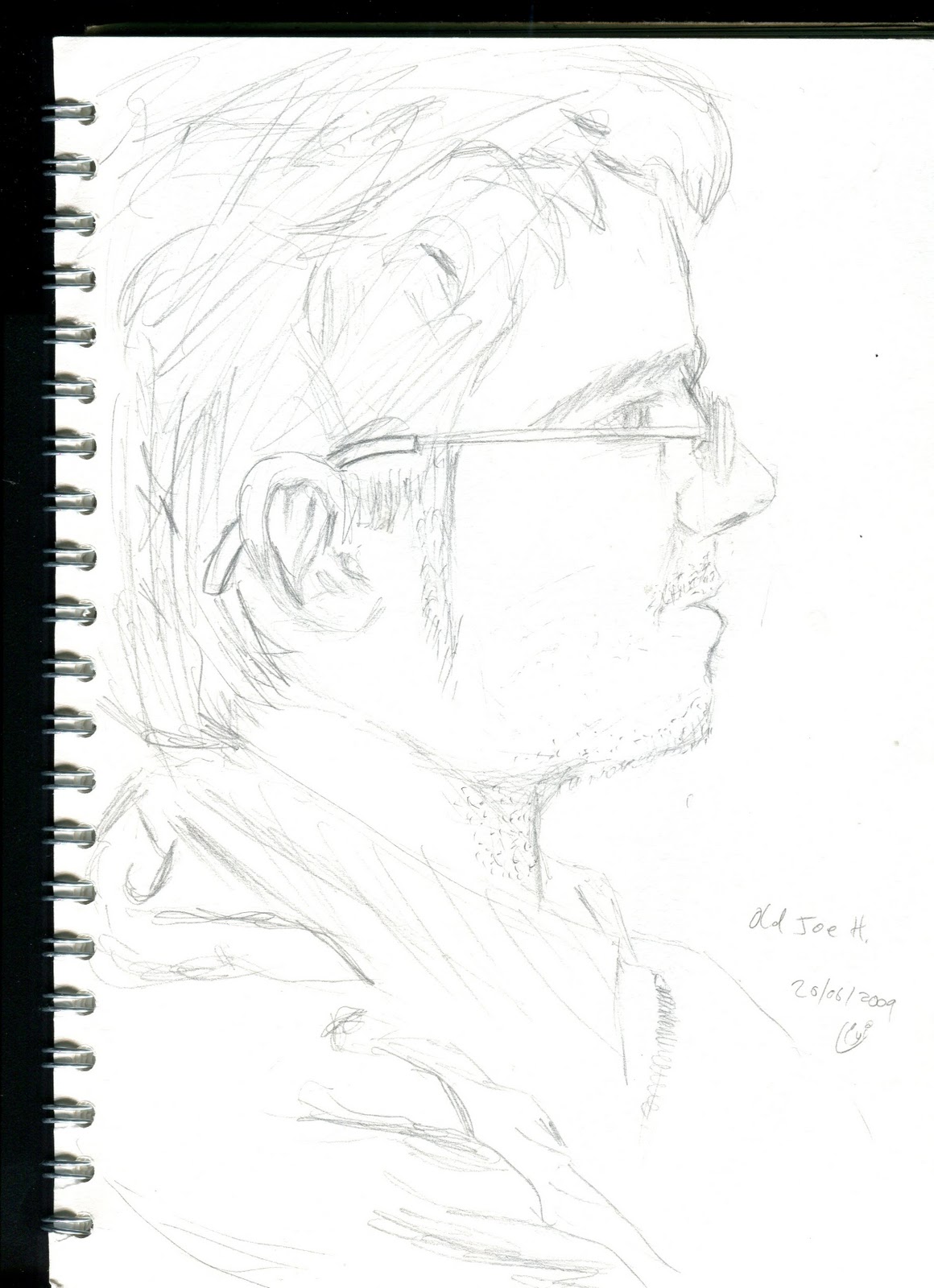
Sketchy Hasty Iota Tid-bits
I plan to get a scanner for Christmas. I'm sick of having to deal with the queues for scanners at school. But luckily I have bothered to scan some stuff from my sketchbooks. Do enjoy :D
[Click to enlarge]


[Click to enlarge]




Wednesday, 8 December 2010
First foray into video games development
I'm certain that any experienced coder out there or seasoned computer geek would be scoffing at my attempt here. For one thing, this was in the written tutorial wizard, so unless I was extremely thick and illiterate I would not have been able to pull this off. Yet, I still feel rather proud of this.
To download the game and play it, follow the link at the bottom of this post and simply download.
That last screenshot shows my current highscore of 1400. Feel free to beat that if the game keeps your interest long enough lol.
DOWNLOAD: http://www.mediafire.com/?4h83x1za3l4ocjo
(please make sure you have something to extract files from .rar files - applications such as WinRar)
To download the game and play it, follow the link at the bottom of this post and simply download.
 | |
Game Maker was the software I used to make this. It has a free "Lite" version with a "Pro" version available for purchase. It's pretty damn simple as game making software goes as it has a "Simple Mode" so you don't have to type in code, but rather navigate menus and icons to achieve what you want.
 |
| If you think this looks complicated, don't. This is child's play compared to how games are REALLY made. |
 |
| So the game looks like this when you open it. CLICK THEM FRUITS! |
 |
| As time goes on, bombs start appear. Don't click on those if you don't want to blow up. |
 |
| ... more and more bombs appear. Damn that cherry is hard to catch. |
 |
| gAAHhh! |
 |
| Well, game over. |
That last screenshot shows my current highscore of 1400. Feel free to beat that if the game keeps your interest long enough lol.
DOWNLOAD: http://www.mediafire.com/?4h83x1za3l4ocjo
(please make sure you have something to extract files from .rar files - applications such as WinRar)
Subscribe to:
Posts (Atom)