*cricket chirps*
*tumbleweed*
Gosh, this place is dusty. Pretty cold too.
My first term at Central Saint Martins has been largely undocumented on this blog. Adjusting to life in London, keeping up with my course as a student and student rep, as well as being actively involved in my music society seems to have re-routed most of my energy.
However, the xmas holiday season is upon us, and I shall endeavor to revamp this ol' place up. Learning code is on my to-do list, and with all these talented people here at UAL, I hope to really tear it up.
Tuesday, 6 December 2011
Sunday, 11 September 2011

Friday, 9 September 2011

Wednesday, 10 August 2011
A tribute to our police
As you may or may not know, England has been plagued with some surprisingly awful riots. It started in London and has spread throughout the countries in major cities, one of which includes my current home city of Manchester.
As I type now, The Greater Manchester Police have commited their best to fend off the thugs and scum from damaging the city too much. For that, I solemnly salute their efforts and courage.
I offer my tribute to them:
Here's hoping the violence will be ending soon.
As I type now, The Greater Manchester Police have commited their best to fend off the thugs and scum from damaging the city too much. For that, I solemnly salute their efforts and courage.
I offer my tribute to them:
 | ||||
| [click to enlarge] |
Here's hoping the violence will be ending soon.
Thursday, 4 August 2011
High Speed Camera Action (a.k.a. slow motion footage)
Look what I managed to borrow :D
This is what I shot with it:
Enjoy the video : )
 |
| Casio EX-F1 |
This is what I shot with it:
Enjoy the video : )
Tuesday, 2 August 2011

Saturday, 9 July 2011

MMU FMP: a bit of a catch up
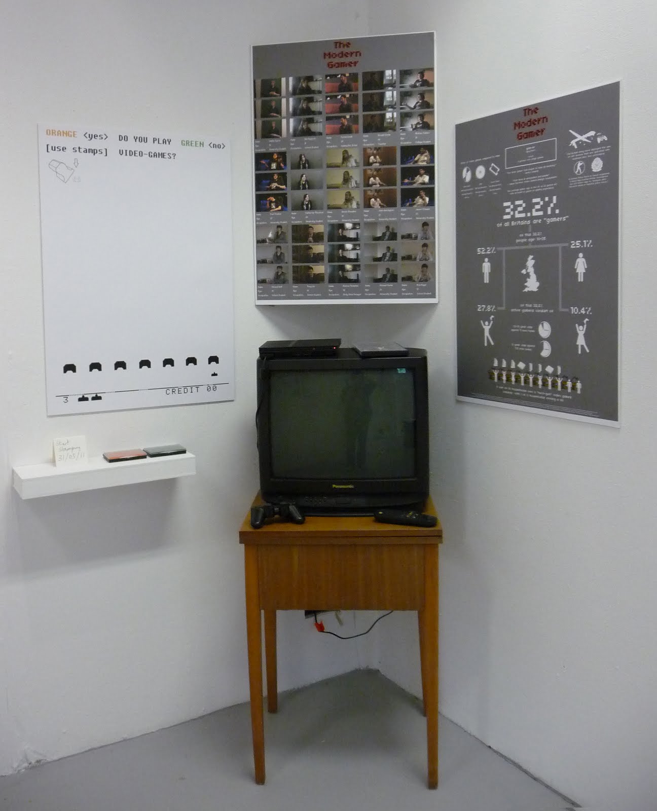
Well, dear readers, I should recount some things. I'll start off in this post with my final major project exhibition. It was hard work, and one of the first times I had ever attempted to make a video of this kind... and it is still wrought with technical hitches and some inconsistencies which I'm sure more sharp observers will distinguish, however, I hope the overall message comes through.
I suppose what I can report is that I enjoyed the project overall. Finding the people to interview was probably the most interesting part; I've never really put myself out like that before, and the range of responses I received was pretty good (even if they weren't used in the final product). For one, I got responses from people as old as 46 and as young as 13 which really shows the breadth of the age range.


Someday, I do hope to produce a much more fleshed out version of what I did here. In particular, the proper research and surveys... I will admit that some of those statistics have been drawn from unfounded facts >.> but I'm hoping you didn't know that until I told you just now eh heh heh.
A lot of work was spent in the gathering of interviews... so tons of time required when trying to get a hold of people, arranging slots of time to do the filming and recording... then the amount of problems and timing issues, I can remember 2 particular cases that ended up wasting an entire day for me ¬¬ *grumble grumble* But I am very thankful of those who did take out time to be involved, and I certainly hope it was as enjoyable for them as it was for me to talk about video games.
****
I'll apologise in advance, but I feel the need to rant about something. It's slightly related to this project, I'll add, so don't turn off in disgust/annoyance just yet ^_^;
It's to do with the opening night of the degree shows during the private view evening. I have a bone to pick with the people who thought it was alright to supply that amount of alcohol. Then again, I suppose, as a student, it was pretty awesome to have the Font Bar sponsor the event by providing the alcoholic drinks, however, the amount at which they were serving them up (by the cratefuls I'll say) is fine I guess, but what really got to me was the kind of people this was attracting.
I swear, about 1/3 of the people who turned up, came purely for the alcohol and probably had little to no interest in the degere shows. Although, I suppose you can look at it another way and say that it was great for attracting people to see the shows that would have never have come otherwise.
Oh rather, I'm just FUCKING PISSED OFF that someone stole one of my stamps. The survey sheet that I produced to be stamped on had two ink pads and two stamps to stop people mixing the inks. Some DOUCHEBAG decided to nick off with one - and I can even second guess the thought process going through his/her head: "Wow, neat stamp, I don't care how much effort or money this perhaps cost the exhibitor, I'm going to knick it and use it to stamp across my pathetic looking notebooks and random bar walls so I can be kinda cool and hipster like, y'know, like like herp a derp derp asdhlifdajkldgafdjghjkllagag- FUCK YOU.
I know, I know. The tutors warned me before hand... and in fact even had a precursor to this happening when I lost a 4-way power extension lead when I went to collect my things from PAT testing. I was told that my stuff would be safe, and I had CLEARLY LABELLED it with my name. I kind of shrugged it off, as it was a power lead... and I only needed two plug sockets luckily with no one else around me requiring electricity. It really annoys me that I won't be able to get to the bottom of this, so really my punchbag took another beating...
Right, I'll stop there. Bottom line, I only have myself to blame. I'm learning the lesson that there aren't that many people in this world that are worth your trust, except a handful. Also, looking at the kind of abuse my survey sheet took, it's a stark reminder that I'm still a Nobody, so people will tend to look down on you even on the same level, if not lower. I'll just be sure to climb that ladder with more determination.
Perhaps I should quote this:
"Never tell your problems to anyone...20% don't care and the other 80% are glad you have them.."
- Lou Holtz
I'm inclined to agree. For one... I still can't get rid of the tumble weeds and crickets here... gosh... need to do something drastic about that.
*sigh*
 |
| ta-dah, my space before the shows opened |
I suppose what I can report is that I enjoyed the project overall. Finding the people to interview was probably the most interesting part; I've never really put myself out like that before, and the range of responses I received was pretty good (even if they weren't used in the final product). For one, I got responses from people as old as 46 and as young as 13 which really shows the breadth of the age range.


Someday, I do hope to produce a much more fleshed out version of what I did here. In particular, the proper research and surveys... I will admit that some of those statistics have been drawn from unfounded facts >.> but I'm hoping you didn't know that until I told you just now eh heh heh.
A lot of work was spent in the gathering of interviews... so tons of time required when trying to get a hold of people, arranging slots of time to do the filming and recording... then the amount of problems and timing issues, I can remember 2 particular cases that ended up wasting an entire day for me ¬¬ *grumble grumble* But I am very thankful of those who did take out time to be involved, and I certainly hope it was as enjoyable for them as it was for me to talk about video games.
****
I'll apologise in advance, but I feel the need to rant about something. It's slightly related to this project, I'll add, so don't turn off in disgust/annoyance just yet ^_^;
It's to do with the opening night of the degree shows during the private view evening. I have a bone to pick with the people who thought it was alright to supply that amount of alcohol. Then again, I suppose, as a student, it was pretty awesome to have the Font Bar sponsor the event by providing the alcoholic drinks, however, the amount at which they were serving them up (by the cratefuls I'll say) is fine I guess, but what really got to me was the kind of people this was attracting.
I swear, about 1/3 of the people who turned up, came purely for the alcohol and probably had little to no interest in the degere shows. Although, I suppose you can look at it another way and say that it was great for attracting people to see the shows that would have never have come otherwise.
Oh rather, I'm just FUCKING PISSED OFF that someone stole one of my stamps. The survey sheet that I produced to be stamped on had two ink pads and two stamps to stop people mixing the inks. Some DOUCHEBAG decided to nick off with one - and I can even second guess the thought process going through his/her head: "Wow, neat stamp, I don't care how much effort or money this perhaps cost the exhibitor, I'm going to knick it and use it to stamp across my pathetic looking notebooks and random bar walls so I can be kinda cool and hipster like, y'know, like like herp a derp derp asdhlifdajkldgafdjghjkllagag- FUCK YOU.
I know, I know. The tutors warned me before hand... and in fact even had a precursor to this happening when I lost a 4-way power extension lead when I went to collect my things from PAT testing. I was told that my stuff would be safe, and I had CLEARLY LABELLED it with my name. I kind of shrugged it off, as it was a power lead... and I only needed two plug sockets luckily with no one else around me requiring electricity. It really annoys me that I won't be able to get to the bottom of this, so really my punchbag took another beating...
Right, I'll stop there. Bottom line, I only have myself to blame. I'm learning the lesson that there aren't that many people in this world that are worth your trust, except a handful. Also, looking at the kind of abuse my survey sheet took, it's a stark reminder that I'm still a Nobody, so people will tend to look down on you even on the same level, if not lower. I'll just be sure to climb that ladder with more determination.
 | |||
| I do have to ask: Was it too much to expect the stamping to be more... aligned? I'm just asking... |
Perhaps I should quote this:
"Never tell your problems to anyone...20% don't care and the other 80% are glad you have them.."
- Lou Holtz
I'm inclined to agree. For one... I still can't get rid of the tumble weeds and crickets here... gosh... need to do something drastic about that.
*sigh*
Sunday, 19 June 2011

Sunday, 12 June 2011
*Cricket Noises*
>.> oh dear... would you look at that, my potted plants have died.
Gosh, it's awfully dusty in here. I think I need to rectify that. *ahem* in the mean time as I readdress this terrible terrible curse of a hiatus (for no good reason I suppose) let me distract you with a picture of a kitty.

Gosh, it's awfully dusty in here. I think I need to rectify that. *ahem* in the mean time as I readdress this terrible terrible curse of a hiatus (for no good reason I suppose) let me distract you with a picture of a kitty.

Wednesday, 18 May 2011
SIGH #5
LOOK WHAT I FOUND! :D I found this whilst looking at infographics for one of my final pieces of the FMP.

Via: Medical Billing And Coding
VIA: http://www.coolinfographics.com/blog/2011/5/10/sitting-all-day-is-killing-you-infographic.html
It's a great blog too, I recommend subscribing to it.
Via: Medical Billing And Coding
VIA: http://www.coolinfographics.com/blog/2011/5/10/sitting-all-day-is-killing-you-infographic.html
It's a great blog too, I recommend subscribing to it.
Monday, 2 May 2011
SIGH #4
It's been a loooOOOOOoong time. But here, I'll share something worthwhile with you to make up for it.
This is a visual essay that is filled with nuggest of wisdom, some obvious, others not; but it is as the author, Jamie Wieck, describes: "a list of 50 things I believe every graphic design student should know on leaving college.
So, I emplore you to take a look, digest what needs to be, and salute you in your endeavours as a member of the graphics world.
 | ||
[Click here to see "The 50 Things Every Graphic Design Student Should Know"]
This is a visual essay that is filled with nuggest of wisdom, some obvious, others not; but it is as the author, Jamie Wieck, describes: "a list of 50 things I believe every graphic design student should know on leaving college.
So, I emplore you to take a look, digest what needs to be, and salute you in your endeavours as a member of the graphics world.
Friday, 22 April 2011
MMUGG i42 event

You saw it here first, folks.
All copyrights belong to their respective owners (team fortress 2 - valve).
Thursday, 31 March 2011
A Proud Moment to share
Dear readers (all 2 of you... XD),
It is to my delight to inform you that all my hard work has paid off with a wonderful result of an "Unconditional" decision from The Glasgow School of Art.
This makes me very happy :D
It is to my delight to inform you that all my hard work has paid off with a wonderful result of an "Unconditional" decision from The Glasgow School of Art.
 |
| I know it seems bitter to say this... but SCREW YOU KINGSTON! |
This makes me very happy :D
Wednesday, 30 March 2011


Sunday, 27 March 2011
An Italian liqueur
Upon my mother's return to England, from Italy, she gave me a packet of Baci chocolates (courtesy of a friend she was staying with), an itallian map themed apron and tea towel (so what, I like to cook) and an individual's bottle of Limonoro's Limoncello Liqueur... in the shape of a violin :D
The taste is undeniably of lemon (but of course) and it's alcoholic, yah yah. *sigh* look I'm no drinks connoisseur ok?! But the bottle and label are very splendid, and although I can't quite express why the drink was nice, I did enjoy it dry and with a bit of ice.
Onto talking about the packaging:
The plastic wrapping with the cardboard tag is practical, but it does remind me of the cheap wrapping you'd get with a cheap plastic toy of sorts, usually found in a souvenir shop that was placed for the sake of tourism for tourism's sake. Other than that, the actual bottle and label are fantastically designed and produced.
 First of all, the label belongs to a brand known as Limonoro, a company that makes Limoncello and other lemon liqueurs for an assortment of chocolates as well as other beverages. It is shaped like a lemon leaf, and reminds me of Jiff's packaging for lemon juice in that approach. The font is something I am unable to identify, but I am running it through WhatTheFont's forum to see if anyone has any idea what it is exactly (I'll keep you posted about that).
Now, onto the remarkable part: The bottle itself. It is shaped like a violin! w00t! I play(ed) the violin and having a bottle shaped as one feels remarkable. Also, it's small and seems collectable and decorative. Also, there's a nice touch with the bottle lid being attached with a metal bale (I'm unsure what the technical term for this kind of lid is...) but it gives a vintage feel about it, as opposed to the metal caps found on most bottled alcohol. On closer inspection, you can even see the details of the strings and sound holes (the "f" looking parts) have been moulded out.
All in all, it comes out as a very neat little object that can still be kept and displayed long after the liqueur has been consumed. A seemingly perfect souvenir stuff that can be enjoyed in both short and long term.
 |
| a brand new bottle in packaging fit for plastic toys... |
 |
| so it comes from Sorrento, just south of Napoli |
 |
| if you haven't noticed already, the bottle is a violin shape |
 |
| some sort of official documentation of authenticity |
 |
| yes, it's rather strong, should be drunken in shots I think |
 | ||
| but ehm... I decided to drink like a whiskey... |
The taste is undeniably of lemon (but of course) and it's alcoholic, yah yah. *sigh* look I'm no drinks connoisseur ok?! But the bottle and label are very splendid, and although I can't quite express why the drink was nice, I did enjoy it dry and with a bit of ice.
Onto talking about the packaging:
The plastic wrapping with the cardboard tag is practical, but it does remind me of the cheap wrapping you'd get with a cheap plastic toy of sorts, usually found in a souvenir shop that was placed for the sake of tourism for tourism's sake. Other than that, the actual bottle and label are fantastically designed and produced.
 First of all, the label belongs to a brand known as Limonoro, a company that makes Limoncello and other lemon liqueurs for an assortment of chocolates as well as other beverages. It is shaped like a lemon leaf, and reminds me of Jiff's packaging for lemon juice in that approach. The font is something I am unable to identify, but I am running it through WhatTheFont's forum to see if anyone has any idea what it is exactly (I'll keep you posted about that).
Now, onto the remarkable part: The bottle itself. It is shaped like a violin! w00t! I play(ed) the violin and having a bottle shaped as one feels remarkable. Also, it's small and seems collectable and decorative. Also, there's a nice touch with the bottle lid being attached with a metal bale (I'm unsure what the technical term for this kind of lid is...) but it gives a vintage feel about it, as opposed to the metal caps found on most bottled alcohol. On closer inspection, you can even see the details of the strings and sound holes (the "f" looking parts) have been moulded out.
All in all, it comes out as a very neat little object that can still be kept and displayed long after the liqueur has been consumed. A seemingly perfect souvenir stuff that can be enjoyed in both short and long term.
Thursday, 24 March 2011
MMU: An Intrusion
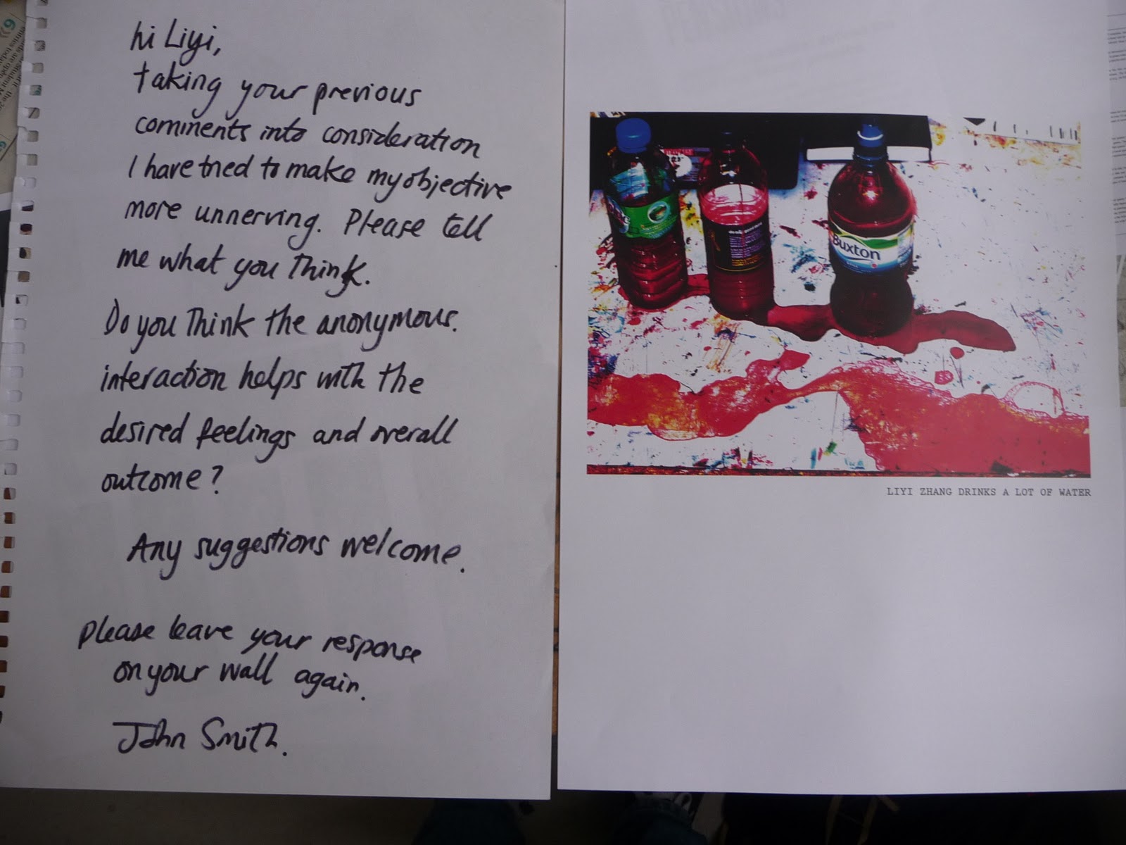
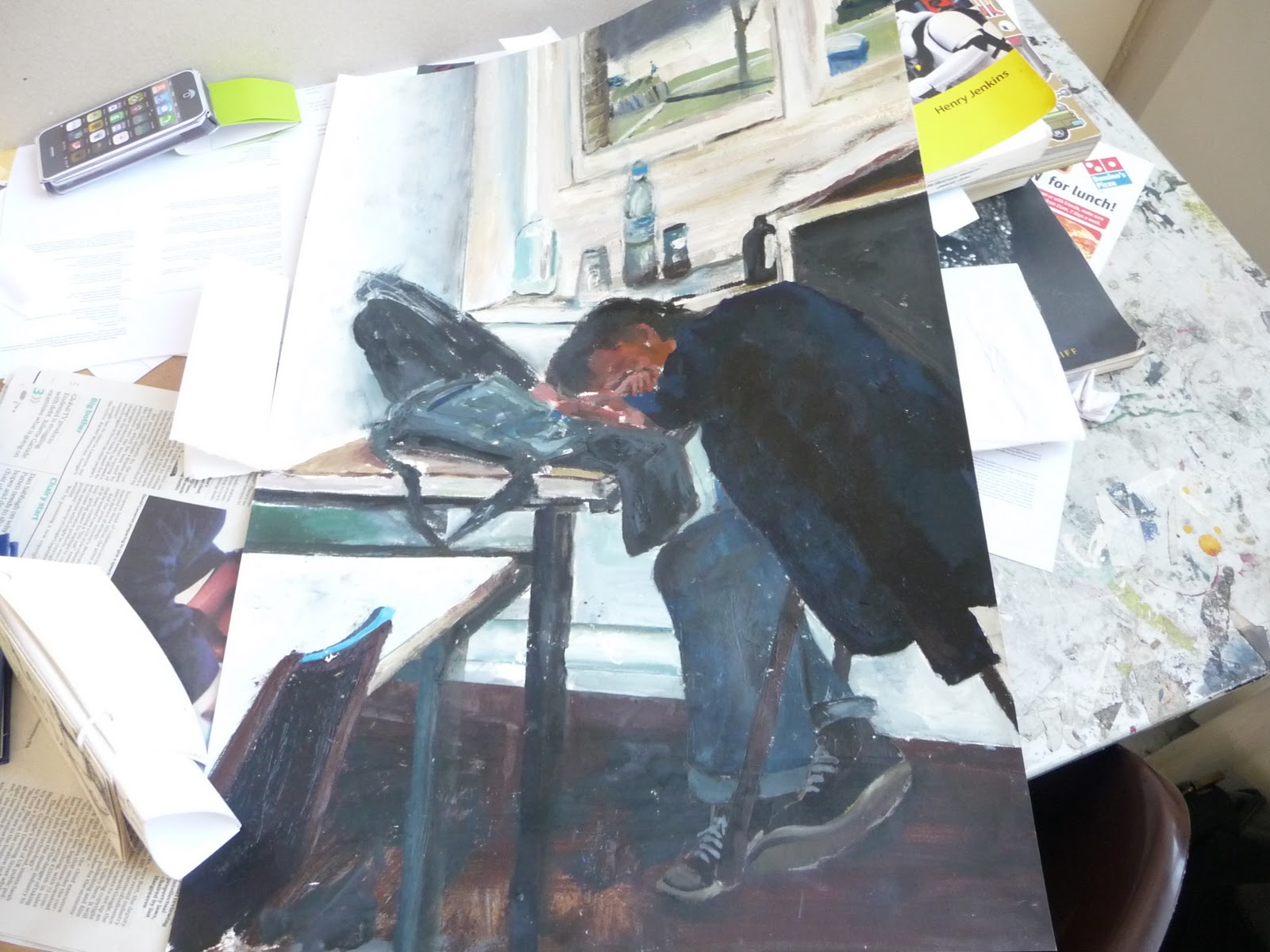
MR. JOHN SMITH!

So, I've been outta action for Monday and Tuesday (one due to illness, the other due to an interview), when I came back on the Wednesday, I have an odd surprise of an oil painting and a note.


A transcript:
START TRANSCRIPT
Dear Liyi,
As you may have seen from my poster on the notice board, my fmp is about intrusion. As you haven't crossed your name off the list I put up, I have chosen you as a subject. I have left you the painting I have been working on and I would really appreciate some feedback about the painting from you. Obviously I am not expecting a great amount of feedback, a few words about what you think about being chosen to be part of the project. Once you have done this, leave the painting and feedback at [crossed off]Reception[crossed off/] with Margaret addressed to John Smith, where I will collect it.
Thank you very much for your participation,
John Smith
(hit me up on facey b BROTHA)
END TRANSCRIPT
That painting is based off a photo. I know this because I remember a flash going off whilst I was sleeping in that position. I was half awake, so I remember hearing the clicking of a d-slr shutter. From what I'll comment about the painting... It's an oil painting, but it looks rushed... and parts are out of proportion, but that's just an objective observation.
In terms of how I feel: I like the idea they're going with, and I'm kinda touched by the idea of having an original painting being delivered to my studio space as an unexpected commission. I probably should ask the question "why me?" y'know, if it was random, or if this person wanted to see what sort of reaction I'd garner. Whatever it is, I intend to continute correspondence - it feels as though I've been inadvertantly entered into a tennis match of sorts, and so far I've just returned the ball in a straightforward manner, eagerly anticipating Mr. Smith's next move. Hmm... actually, I don't feel John Smith deserves the "Mr." part yet. I'll revert to calling him John for now I suppose...
A transcript of my response (on the right):
START TRANSCRIPT
Dear John Smith,
It was a pleasant surprise to find an original painting of myself unconcious upon my studio desk.
So far, I like it.
However, for the theme of intrusion, it feels a bit mild. It comes across more as an unexpected commission, rather thaan something intrusive.
Step it up Mr. "Smith".
I look forward to your further exploits >: )
kind regards,
Liyi Zhang
END TRANSCRIPT

So, I've been outta action for Monday and Tuesday (one due to illness, the other due to an interview), when I came back on the Wednesday, I have an odd surprise of an oil painting and a note.

A transcript:
START TRANSCRIPT
Dear Liyi,
As you may have seen from my poster on the notice board, my fmp is about intrusion. As you haven't crossed your name off the list I put up, I have chosen you as a subject. I have left you the painting I have been working on and I would really appreciate some feedback about the painting from you. Obviously I am not expecting a great amount of feedback, a few words about what you think about being chosen to be part of the project. Once you have done this, leave the painting and feedback at [crossed off]Reception[crossed off/] with Margaret addressed to John Smith, where I will collect it.
Thank you very much for your participation,
John Smith
(hit me up on facey b BROTHA)
END TRANSCRIPT
That painting is based off a photo. I know this because I remember a flash going off whilst I was sleeping in that position. I was half awake, so I remember hearing the clicking of a d-slr shutter. From what I'll comment about the painting... It's an oil painting, but it looks rushed... and parts are out of proportion, but that's just an objective observation.
In terms of how I feel: I like the idea they're going with, and I'm kinda touched by the idea of having an original painting being delivered to my studio space as an unexpected commission. I probably should ask the question "why me?" y'know, if it was random, or if this person wanted to see what sort of reaction I'd garner. Whatever it is, I intend to continute correspondence - it feels as though I've been inadvertantly entered into a tennis match of sorts, and so far I've just returned the ball in a straightforward manner, eagerly anticipating Mr. Smith's next move. Hmm... actually, I don't feel John Smith deserves the "Mr." part yet. I'll revert to calling him John for now I suppose...
 |
| My reply was late due to unforseen circumstances |
A transcript of my response (on the right):
START TRANSCRIPT
Dear John Smith,
It was a pleasant surprise to find an original painting of myself unconcious upon my studio desk.
So far, I like it.
However, for the theme of intrusion, it feels a bit mild. It comes across more as an unexpected commission, rather thaan something intrusive.
Step it up Mr. "Smith".
I look forward to your further exploits >: )
kind regards,
Liyi Zhang
END TRANSCRIPT
Friday, 18 March 2011
Tate Modern: Ai Weiwei Sunflower Seeds - Answering a question
Well, I visited the sunflower seed exhibit at the Tate Modern. I must say, it's amazing to see in person, I'm just disappointed I couldn't get to jump into it and play around like I saw people do on BBC news... so disappointed >:(
Anyways, I digress. Here's a video of me responding to the exhibit, which Ai Weiwei will probably never see - the whole thing does seem interesting to spark discussion amongst online forums.
[Link to video]
Anyways, I digress. Here's a video of me responding to the exhibit, which Ai Weiwei will probably never see - the whole thing does seem interesting to spark discussion amongst online forums.
[Link to video]
Monday, 7 March 2011
Final Major Project (FMP): Some inspiration
I'll be posting up later to explain my FMP in some more detail, but for now, here's a look at some inspiration for a branching idea I currently have:
First off is a superb short film that features live footage with amazing special effects, Patrick Jean's "PIXELS":
PIXELS by Patrick Jean from ONE MORE PRODUCTION on Vimeo.
Next we have a 2010 PS3 release called 3D Dot Game Heroes:
First off is a superb short film that features live footage with amazing special effects, Patrick Jean's "PIXELS":
PIXELS by Patrick Jean from ONE MORE PRODUCTION on Vimeo.
Next we have a 2010 PS3 release called 3D Dot Game Heroes:
Friday, 4 March 2011
MMU One Day Project: Timeline
This ties in with what I'm thinking about for my Final Major Project ("woooOOOooOoooo..."... it was supposed to be an ominous noise, because it's a big deal).

I remember the day when I first got my Gameboy Colour (turquoise) and my very own copy of Pokemon Blue (EU). Many many hours have gone to my love and passion for video games, and that gameboy (which I still own :D) launched me into the world of video games and many spent AA batteries. Oh, and before you think that was a bad thing, Pokemon actually made me friends (as well as lose perhaps one or two XD).
The images were drawn by me, all except the screenshot which was doctored with modified text.

Wednesday, 2 March 2011
MMU One Day Project: 18 Things to do in a day
Ok, so it took more than one day to do, but who cares. I've lost sleep over this to get it done, mind. Not to mention I've come to the realisation that my desktop is not as powerful as I first realised. Perhaps a spring cleaning of the HDD is in order sometime this spring - most likely I'll take time out during easter to format the whole thing.
Anyhoo, here's a lovely compressed version of my second edit - and perhaps I'll leave it at the second edit. I've certainly learnt a LOT whilst filming this, and although it's not to my personal satisfaction (what with technical and planning hiccups) I'll be well armed for my next bout of video making >:)
Music credits:
"Blue Sky" - David o Brien and Abdel-Rehim
"Crumpets and Croquet" - Paul Mottram
"Green Acre" - Terry Devine-King and Adam Drake
Monday, 14 February 2011

Sunday, 13 February 2011
Let me lend you a H.A.N.D.
I had drawn these designs on my original line drawings of the guns for my Subject Matters Project. I decided to use a computer to achieve some better results.
The computer certainly allowed for a sleeker and quicker finish.
 |
| [click to enlarge] |
The computer certainly allowed for a sleeker and quicker finish.
Friday, 11 February 2011
MMU One Day Project: Remix Love
I like making pictures from miscellaneous shapes ¦ 3
Google likes Robert Indiana too.

 | |
| Love Bot |
 |
| Love Violin |
Google likes Robert Indiana too.

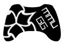
MMU Gamer's Group Logo
The Gamer's Group is a society I decided to join when I went to the Freshers' fair way back in September. Cost me a good £6 for membership, and so far, I've only been able to attend about 3 socials - but my attendence hasn't been regular enough to really form much of a bond with my fellow gamers. Add in some scarce time from online games and I've only got the facebook group page to really chip in my bit.
Regardless though, I do appreciate the society, and sorely wish that I could attend more, if it were not for my different timetable to everyone elses' and my piling up of work as pressure drives down for interviews.
Now, a discussion was brought up on the facebook group page about the society's logo:

Let's compare MMUGG's logo and University of Manchester Gaming Society's logo:


Both differ greatly in their approach.
On the one hand, we have MMU's very bold, simple and effective logo, a silhouette of an xbox 360 controller with "mmu" written in Arial Black to denote which university it belongs to. It could be argued that it's a little plain, but the message gets through clearly - "gaming at MMU".
On the other hand, Manchester University's logo appears a lot more friendlier, more colourful, but I have to disagree with the presentation of the type - the "g" is too obscured behind what is a well drawn SNES controller, but that in turn is obscured by the "s". I can only comment that this is perhaps a bad layout decision, but otherwise, the individual elements could serve to make a nice logo. The choice of a fourth gen SNES controller as opposed to a current gen seems to denote they have more appreciation for classic gaming, but I'm unsure if that is their desired communication.
Well, it wasn't really asked for, but I felt like it would be a bit of fun, I volunteered to re-design the MMU logo for the Gamer's Group. Yes, even though I'm already busy with portfolio mounting, one day projects and personal project, I still decided to put out 2-4 hours on this little self commission.
And here are the results:
So here are three drafts of the logo. The first one was an immediate reject to be honest. I had wondered that the gaming society is affiliated with MMU, so why is there no university logo to go with it? For all we know, the "mmu" on the current logo could denote to "Multi Media Union" or something. But as you can probably see in the layout of the "MMU GG" it now looks like I've created some sort of face - not a friendly one either.
The first two drafts has the inclusion of the big three gaming platforms I've noticed at the Kyoto Lounge so far: PC, PS3 and XBOX 360. It made sense to try and add three representations of the platforms into the logo, however the icons appear too small - all we'd really see as a whole is the MMU logo, and unless I went out of my way to add even more detail to turn it into a type of coat of arms, as the second draft stands, it's too simple to notice the icons, and not detailed enough to be worth zooming in to take a closer look. Also, I tried to put the words down the side to see how it looked. It worked, but it's gotten too big now.
The third draft, I decided to just revamp the current design. I mean it works so well, why radically change it so much? However, I've chosen a controller that is universally recognised generically and specifically - for example show the controller to someone clueless about gaming and they'd be able to splutter something along the lines of "game-station-play-boy-360?".
The face buttons have the MMU logo instead and there is some bitmap type to say "MMUGG".
But there's more.


It's a funny thing, the more I looked at the original, the more it looked well suited and well designed, but there was just something that could be done better. A lot of it rides on the already well designed xbox controller, but hey it works, it's just the choice of type that throws it off a bit. So how about just replacing the text with the MMU Logo? There's even a version with "GG" in it to denote "Gamer's Group".
I also decided to invert the third draft to see how it looked, and it looks alright.
Anyways, moderators and administrators, I leave the decision to you, which logo to use: if none of my iterations have marked any improvements, by all means stick to the original that does pretty well anyway. Do leave comments please and thanks for reading (if you bothered) :)
Even more after some quick feedback:


After further feedback, it seems the XBOX 360 controller is the preferred representation of the height of social gaming. So, really sticking with the base of the original logo, I tried to impliment the MMU logo in a way that didn't remind everyone of the recycle pictogram. The choice of Arial Black didn't quite add up well to the logo overall, so I took a look through several fonts:


Well, after spending quite a bit of time, I think I'll settle with one final design - mods and admins of MMUGG, feel free to use any of the designs here, if there's something in particular you'd like tweaking, post a comment and I'll modify a design.
Regardless though, I do appreciate the society, and sorely wish that I could attend more, if it were not for my different timetable to everyone elses' and my piling up of work as pressure drives down for interviews.
Now, a discussion was brought up on the facebook group page about the society's logo:

Let's compare MMUGG's logo and University of Manchester Gaming Society's logo:
Both differ greatly in their approach.
On the one hand, we have MMU's very bold, simple and effective logo, a silhouette of an xbox 360 controller with "mmu" written in Arial Black to denote which university it belongs to. It could be argued that it's a little plain, but the message gets through clearly - "gaming at MMU".
On the other hand, Manchester University's logo appears a lot more friendlier, more colourful, but I have to disagree with the presentation of the type - the "g" is too obscured behind what is a well drawn SNES controller, but that in turn is obscured by the "s". I can only comment that this is perhaps a bad layout decision, but otherwise, the individual elements could serve to make a nice logo. The choice of a fourth gen SNES controller as opposed to a current gen seems to denote they have more appreciation for classic gaming, but I'm unsure if that is their desired communication.
Well, it wasn't really asked for, but I felt like it would be a bit of fun, I volunteered to re-design the MMU logo for the Gamer's Group. Yes, even though I'm already busy with portfolio mounting, one day projects and personal project, I still decided to put out 2-4 hours on this little self commission.
And here are the results:
 |
| First Draft |
 |
| Second Draft |
 |
| Third Draft |
So here are three drafts of the logo. The first one was an immediate reject to be honest. I had wondered that the gaming society is affiliated with MMU, so why is there no university logo to go with it? For all we know, the "mmu" on the current logo could denote to "Multi Media Union" or something. But as you can probably see in the layout of the "MMU GG" it now looks like I've created some sort of face - not a friendly one either.
The first two drafts has the inclusion of the big three gaming platforms I've noticed at the Kyoto Lounge so far: PC, PS3 and XBOX 360. It made sense to try and add three representations of the platforms into the logo, however the icons appear too small - all we'd really see as a whole is the MMU logo, and unless I went out of my way to add even more detail to turn it into a type of coat of arms, as the second draft stands, it's too simple to notice the icons, and not detailed enough to be worth zooming in to take a closer look. Also, I tried to put the words down the side to see how it looked. It worked, but it's gotten too big now.
The third draft, I decided to just revamp the current design. I mean it works so well, why radically change it so much? However, I've chosen a controller that is universally recognised generically and specifically - for example show the controller to someone clueless about gaming and they'd be able to splutter something along the lines of "game-station-play-boy-360?".
The face buttons have the MMU logo instead and there is some bitmap type to say "MMUGG".
But there's more.

It's a funny thing, the more I looked at the original, the more it looked well suited and well designed, but there was just something that could be done better. A lot of it rides on the already well designed xbox controller, but hey it works, it's just the choice of type that throws it off a bit. So how about just replacing the text with the MMU Logo? There's even a version with "GG" in it to denote "Gamer's Group".
I also decided to invert the third draft to see how it looked, and it looks alright.
Anyways, moderators and administrators, I leave the decision to you, which logo to use: if none of my iterations have marked any improvements, by all means stick to the original that does pretty well anyway. Do leave comments please and thanks for reading (if you bothered) :)
Even more after some quick feedback:
After further feedback, it seems the XBOX 360 controller is the preferred representation of the height of social gaming. So, really sticking with the base of the original logo, I tried to impliment the MMU logo in a way that didn't remind everyone of the recycle pictogram. The choice of Arial Black didn't quite add up well to the logo overall, so I took a look through several fonts:

Well, after spending quite a bit of time, I think I'll settle with one final design - mods and admins of MMUGG, feel free to use any of the designs here, if there's something in particular you'd like tweaking, post a comment and I'll modify a design.

 |
| [click to enlarge] a sample of how the logo would look in use |
Subscribe to:
Posts (Atom)