
Monday 14 February 2011
Sunday 13 February 2011
Let me lend you a H.A.N.D.
I had drawn these designs on my original line drawings of the guns for my Subject Matters Project. I decided to use a computer to achieve some better results.
The computer certainly allowed for a sleeker and quicker finish.
 |
| [click to enlarge] |
The computer certainly allowed for a sleeker and quicker finish.
Friday 11 February 2011
MMU One Day Project: Remix Love
I like making pictures from miscellaneous shapes ¦ 3
Google likes Robert Indiana too.

 | |
| Love Bot |
 |
| Love Violin |
Google likes Robert Indiana too.

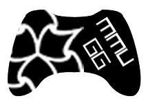
MMU Gamer's Group Logo
The Gamer's Group is a society I decided to join when I went to the Freshers' fair way back in September. Cost me a good £6 for membership, and so far, I've only been able to attend about 3 socials - but my attendence hasn't been regular enough to really form much of a bond with my fellow gamers. Add in some scarce time from online games and I've only got the facebook group page to really chip in my bit.
Regardless though, I do appreciate the society, and sorely wish that I could attend more, if it were not for my different timetable to everyone elses' and my piling up of work as pressure drives down for interviews.
Now, a discussion was brought up on the facebook group page about the society's logo:

Let's compare MMUGG's logo and University of Manchester Gaming Society's logo:


Both differ greatly in their approach.
On the one hand, we have MMU's very bold, simple and effective logo, a silhouette of an xbox 360 controller with "mmu" written in Arial Black to denote which university it belongs to. It could be argued that it's a little plain, but the message gets through clearly - "gaming at MMU".
On the other hand, Manchester University's logo appears a lot more friendlier, more colourful, but I have to disagree with the presentation of the type - the "g" is too obscured behind what is a well drawn SNES controller, but that in turn is obscured by the "s". I can only comment that this is perhaps a bad layout decision, but otherwise, the individual elements could serve to make a nice logo. The choice of a fourth gen SNES controller as opposed to a current gen seems to denote they have more appreciation for classic gaming, but I'm unsure if that is their desired communication.
Well, it wasn't really asked for, but I felt like it would be a bit of fun, I volunteered to re-design the MMU logo for the Gamer's Group. Yes, even though I'm already busy with portfolio mounting, one day projects and personal project, I still decided to put out 2-4 hours on this little self commission.
And here are the results:
So here are three drafts of the logo. The first one was an immediate reject to be honest. I had wondered that the gaming society is affiliated with MMU, so why is there no university logo to go with it? For all we know, the "mmu" on the current logo could denote to "Multi Media Union" or something. But as you can probably see in the layout of the "MMU GG" it now looks like I've created some sort of face - not a friendly one either.
The first two drafts has the inclusion of the big three gaming platforms I've noticed at the Kyoto Lounge so far: PC, PS3 and XBOX 360. It made sense to try and add three representations of the platforms into the logo, however the icons appear too small - all we'd really see as a whole is the MMU logo, and unless I went out of my way to add even more detail to turn it into a type of coat of arms, as the second draft stands, it's too simple to notice the icons, and not detailed enough to be worth zooming in to take a closer look. Also, I tried to put the words down the side to see how it looked. It worked, but it's gotten too big now.
The third draft, I decided to just revamp the current design. I mean it works so well, why radically change it so much? However, I've chosen a controller that is universally recognised generically and specifically - for example show the controller to someone clueless about gaming and they'd be able to splutter something along the lines of "game-station-play-boy-360?".
The face buttons have the MMU logo instead and there is some bitmap type to say "MMUGG".
But there's more.


It's a funny thing, the more I looked at the original, the more it looked well suited and well designed, but there was just something that could be done better. A lot of it rides on the already well designed xbox controller, but hey it works, it's just the choice of type that throws it off a bit. So how about just replacing the text with the MMU Logo? There's even a version with "GG" in it to denote "Gamer's Group".
I also decided to invert the third draft to see how it looked, and it looks alright.
Anyways, moderators and administrators, I leave the decision to you, which logo to use: if none of my iterations have marked any improvements, by all means stick to the original that does pretty well anyway. Do leave comments please and thanks for reading (if you bothered) :)
Even more after some quick feedback:


After further feedback, it seems the XBOX 360 controller is the preferred representation of the height of social gaming. So, really sticking with the base of the original logo, I tried to impliment the MMU logo in a way that didn't remind everyone of the recycle pictogram. The choice of Arial Black didn't quite add up well to the logo overall, so I took a look through several fonts:


Well, after spending quite a bit of time, I think I'll settle with one final design - mods and admins of MMUGG, feel free to use any of the designs here, if there's something in particular you'd like tweaking, post a comment and I'll modify a design.
Regardless though, I do appreciate the society, and sorely wish that I could attend more, if it were not for my different timetable to everyone elses' and my piling up of work as pressure drives down for interviews.
Now, a discussion was brought up on the facebook group page about the society's logo:

Let's compare MMUGG's logo and University of Manchester Gaming Society's logo:
Both differ greatly in their approach.
On the one hand, we have MMU's very bold, simple and effective logo, a silhouette of an xbox 360 controller with "mmu" written in Arial Black to denote which university it belongs to. It could be argued that it's a little plain, but the message gets through clearly - "gaming at MMU".
On the other hand, Manchester University's logo appears a lot more friendlier, more colourful, but I have to disagree with the presentation of the type - the "g" is too obscured behind what is a well drawn SNES controller, but that in turn is obscured by the "s". I can only comment that this is perhaps a bad layout decision, but otherwise, the individual elements could serve to make a nice logo. The choice of a fourth gen SNES controller as opposed to a current gen seems to denote they have more appreciation for classic gaming, but I'm unsure if that is their desired communication.
Well, it wasn't really asked for, but I felt like it would be a bit of fun, I volunteered to re-design the MMU logo for the Gamer's Group. Yes, even though I'm already busy with portfolio mounting, one day projects and personal project, I still decided to put out 2-4 hours on this little self commission.
And here are the results:
 |
| First Draft |
 |
| Second Draft |
 |
| Third Draft |
So here are three drafts of the logo. The first one was an immediate reject to be honest. I had wondered that the gaming society is affiliated with MMU, so why is there no university logo to go with it? For all we know, the "mmu" on the current logo could denote to "Multi Media Union" or something. But as you can probably see in the layout of the "MMU GG" it now looks like I've created some sort of face - not a friendly one either.
The first two drafts has the inclusion of the big three gaming platforms I've noticed at the Kyoto Lounge so far: PC, PS3 and XBOX 360. It made sense to try and add three representations of the platforms into the logo, however the icons appear too small - all we'd really see as a whole is the MMU logo, and unless I went out of my way to add even more detail to turn it into a type of coat of arms, as the second draft stands, it's too simple to notice the icons, and not detailed enough to be worth zooming in to take a closer look. Also, I tried to put the words down the side to see how it looked. It worked, but it's gotten too big now.
The third draft, I decided to just revamp the current design. I mean it works so well, why radically change it so much? However, I've chosen a controller that is universally recognised generically and specifically - for example show the controller to someone clueless about gaming and they'd be able to splutter something along the lines of "game-station-play-boy-360?".
The face buttons have the MMU logo instead and there is some bitmap type to say "MMUGG".
But there's more.

It's a funny thing, the more I looked at the original, the more it looked well suited and well designed, but there was just something that could be done better. A lot of it rides on the already well designed xbox controller, but hey it works, it's just the choice of type that throws it off a bit. So how about just replacing the text with the MMU Logo? There's even a version with "GG" in it to denote "Gamer's Group".
I also decided to invert the third draft to see how it looked, and it looks alright.
Anyways, moderators and administrators, I leave the decision to you, which logo to use: if none of my iterations have marked any improvements, by all means stick to the original that does pretty well anyway. Do leave comments please and thanks for reading (if you bothered) :)
Even more after some quick feedback:
After further feedback, it seems the XBOX 360 controller is the preferred representation of the height of social gaming. So, really sticking with the base of the original logo, I tried to impliment the MMU logo in a way that didn't remind everyone of the recycle pictogram. The choice of Arial Black didn't quite add up well to the logo overall, so I took a look through several fonts:

Well, after spending quite a bit of time, I think I'll settle with one final design - mods and admins of MMUGG, feel free to use any of the designs here, if there's something in particular you'd like tweaking, post a comment and I'll modify a design.

 |
| [click to enlarge] a sample of how the logo would look in use |
Monday 7 February 2011
MMU "There's an App for me"
There's an app for me. Well, most certainly, but I do not own an iPhone - and knowing myself in trends of electronics, I tend to acquire many softwares that I would use a few times before just leaving it on my device merely as party tricks or just for show. Although, I could imagine myself using a number of Apps over and over - I'd find a pocket electronic dictionary and thesaurus extremely useful if I had such a device.
The project here asked us to design a set of 16 iPhone App icons. Funny how it's asked exclusively for iPhones, where's the Android love?
The project here asked us to design a set of 16 iPhone App icons. Funny how it's asked exclusively for iPhones, where's the Android love?
 |
| The icons, each one designed or drawn in photoshop. |
 |
| Showing the design on the device as concept. |
 |
| Design printed out on paper with a papercraft version next to it. |
Sunday 6 February 2011
MMU Contextual Project
We had a project that required us to research an artist and then write an essay on the artist. It was to be presented in a booklet with layout and design along with the 500 word written piece inside.
So, it's gotta look good and read well.


The essay:
---
So, it's gotta look good and read well.


The essay:
---
Peter Callesen has worked almost exclusively with paper in recent years. The Danish born artist, who had studied at Goldsmiths College in London, is known mostly for precise and intricately crafted paper pieces done on ordinary A4 sheets of printer paper. He astounds viewers with the endless possibilities that such a common material is capable of, causing disbelief and wonderment in each of his pieces.
Paper is the base of Callesen's works. He creates meticulously crafted works, that show in their complexity of form, yet the simpleness of having it formed through a single sheet of paper, whereby the “figures (in his work) still stick to their origin, without the possibility of escaping” is astonishing. There is also a point to be made over the commonality of the A4 sheet of paper, and how Calleson tries to prove the plethora of possibilities of this very simple material. He points out how people “rarely notice the actual materiality of the A4 paper” and that by “removing all the information and starting from scratch using the blank white 80gsm A4 paper... I feel that I have found a material which we are able to relate to... and therefore easier to fill with different meanings.”
There is an inherent playfulness in Callesen's works. Many involve “fantastic dreams of childhood” with a play of 3D and 2D, using both dimensions to tell two sides of a narrative, or sometimes as a visual pun. The negative space left behind on the cut out paper forms the 2D aspect of the work and the pieces are used to form a sculptural 3D piece that comes out of its flat plain, thereby forming the two visual forms – one of fantasy (2D) and the other breaching into reality (3D). These two images are usually juxtaposed to represent the lighthearted fairy-tale along with it's darker underlying tones.
Much can be said that his works are dream like and reflective. The way in which these sculptures break out of the 2D plain, exposing themselves to the third dimension, creates a fragility that we react to due to the delicate nature of the material. There is an astounding beauty in his carefully crafted piece such as “Half Way Through” depicting a skeleton sitting up, still attached to the paper, it is with the intricate details and the miniature scale that we find ourselves captivated by the piece as well as feeling precious towards it. More astonishing, is that the crafted sculptures are created with exactly the amount of paper cut out from the A4 sheet, as seen in “On The Other Side”.
The techniques employed in his A4 paper cuts are also used in his large scale work. These come in the form of huge installations which changes the reactions slightly when viewed. These works may seem like a scale up from his miniatures, but they contain twice as much detail as he has already included on a smaller scale. Notable works are life size and they evoke a sense of disbelief that they are made entirely out of paper, for example “White Window” which is as big as the windows found on the side of a cathedral, yet absolutely delicate when you realize the temporary nature of the material it has been built with.
---
Subscribe to:
Posts (Atom)