 |
| "Brushing my teeth has never made me feel so... shady." |
Thursday 27 January 2011
Sunday 23 January 2011
SIGH #3
Just found a neat little comic strip that typographers who are tired of seeing Comic Sans used as a typeface in daily life:

Now, who wants to try with me on Monday?
SOURCE: http://www.explosm.net/comics/2301/
Now, who wants to try with me on Monday?
SOURCE: http://www.explosm.net/comics/2301/
Wednesday 12 January 2011
ONE TO FOLLOW
Today, my tutor introduced me to a fantastic blog (well at least in my opinion)
Erik Spiekermann is a revered typographer and designer, based in Germany.
 |
| SpiekerBlog |
Erik Spiekermann is a revered typographer and designer, based in Germany.
Thursday 6 January 2011
SIGH #2
I should've guessed I'd hit my second SIGH round about the holidays, but oh well. What matters is I'm back, mentally refreshed.
Today, I'd like to share with you a wonderful webcomic series a friend directed me to.

Romantic Apicalyptic was created by a russian illustrator and photographer Vitaly S Alexius, who is determining a new digital art style he coins as "Dreaminism". The sense of humour is certainly enjoyable, with a sleek, bleak, gritty setting and twisted, sureal characters - I mean, the Captain will remind us of an exaggerated persona of one or two people we will have met in our lives, certainly.
This style does remind me a lot of Frank Miller's film Sin City, with the whole noir aesthetic. From Alexius' "about" section on the site, he explains that he has used actors and photographs to produce these panels, which does remind me of the Max Payne comic panels very much.
Noticably a different style, the noir trend is still present, and a hunch would say that similar methods were used to produce these panels as they were used in Romantic Apocolyptic. Certainly gives me an idea to use for my next project.
Today, I'd like to share with you a wonderful webcomic series a friend directed me to.
Romantic Apicalyptic was created by a russian illustrator and photographer Vitaly S Alexius, who is determining a new digital art style he coins as "Dreaminism". The sense of humour is certainly enjoyable, with a sleek, bleak, gritty setting and twisted, sureal characters - I mean, the Captain will remind us of an exaggerated persona of one or two people we will have met in our lives, certainly.
This style does remind me a lot of Frank Miller's film Sin City, with the whole noir aesthetic. From Alexius' "about" section on the site, he explains that he has used actors and photographs to produce these panels, which does remind me of the Max Payne comic panels very much.
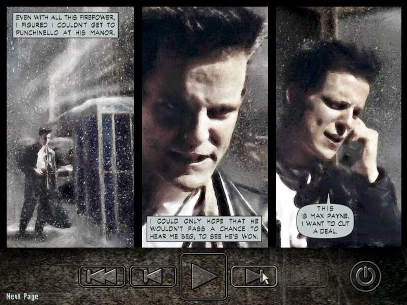 |
| These replaced the conventional "cinematics" from most action games of the time. |
Subscribe to:
Posts (Atom)